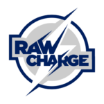
On Jan. 12, a little more than a week ago, the Los Angeles Chargers of the National Football League revealed a poorly planned new logo. It seemed to simply combine two noteworthy elements of the Los Angeles Dodgers’ and Tampa Bay Lightning’s respective uniforms: The LA element that is prominent on Dodgers baseball hats, and the bolt of lightning (flipped horizontally), that dominates the Lightning’s uniforms.
On Jan. 18, it was disclosed to the public that the new logo was nixed. We’re not exactly left wondering why.
Late Wednesday night, an undisclosed source contacted me (a retired blogger, of all people) to reveal a failed alternative logo that had been considered as a potential Chargers logo and… um… uh….
The source was asked how in-play this logo was, considering it utilizing a font similar to what the Dodgers employ on home jerseys, and a lightning bolt that looks like the one used by Tampa Bay from 2007 through 2011. “It was there. Let’s just say that.”
When asked if there were similarity issues, their response was a flat “Are you serious?” They pointed to elements of the logo that were flawed, such as the “charge” electric element not being prominent enough.
Oh, yeah, and geography. When asked to disclose how Los Angeles was suddenly tied to the New York City borough of Brooklyn, the source laughed and wanted to know if I was joking or not. Is that a Dodgers fan thing, to overlook geography? When asked about the Lightning similarity, the source responded with a question of their own, “What’s a ‘Tampa’?”
Suffice it to say, the logo that was revealed to the masses was more modern and realistic than this left-by-the-curb version of the team’s now-nixed new logo.

