
The Syracuse Crunch has a long history of using their parent club’s colors in their own scheme, but has always deviated from their NHL partner when it comes to mascots and logo designs. Today was the unavailing of the new Tampa-Bay Lightning affiliation era Crunch logo. Our new logo design is no different in both cases. The Crunch utilized the Lightning’s colors, but stuck to their own idea as to what our logo should be. As you all could probably guess, some people like it, some people hate it.
I personally really like it, but maybe that’s because I kind of knew what to expect going in. I had gotten some “insider information” towards the end of the season about what the Crunch was planning on doing, so I wasn’t exactly surprised when the logo was unveiled. What I like about it is that it pays homage to where we’ve been, but also looks to our future.
If you’ve already seen it and don’t like it, maybe you will like it better if you see how exactly it all came about!
When the Crunch first started, they had a mascot called Crunchman. Given that name, you probably aren’t shocked to know that he was a superhero. The logo looked like this:

I wasn’t a fan of the team back then, but the Internet tells me we used this logo from ’94/’95, our inaugural season, to the end of the ’98/’99 season. It’s pretty cool, I guess. Kind of chunky, and I hate the colors, but it’s all right.
After that, we went to Al the Ice Gorilla. Why was his name Al? Supposedly, it’s because someone in the front office realized that “Go Al” spells “goal.” I wish I was kidding, but alas, I’m not. During the Columbus Blue Jackets affiliation years, Al looked like this:

Bright, yeah? The only thing that I really liked about this Al, and missed when his colors changed, was the yellow in the design. On the jerseys, the yellow was some kind of glittery paint stuff that glowed when the light hit it. It was pretty sharp. Beyond that, I felt the coloring was just okay.
When we changed affiliates to the Anaheim Ducks, Al’s colors also changed:

This is probably my favorite Al. I liked the way everything came together, and although I missed the eye-catching sparkly paint, it was a small price to pay for not being blinded by brightness.
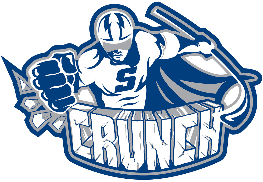
At the end of the ’11/’12 season, Al had been in use for 13 years. With Tampa Bay coming in and a “new era” in Crunch hockey beginning, the front office felt it was time for a change. They wanted something new, more modern, but also wanted to pay tribute to where the team has been.
Ladies and gentlemen, meet the new Crunchman:
The gray you see in the logo is actually more of a silver when you see it in merchandise, which I really like. I think it’s sharp, clean, modern, and fun. It’s got kind of a Silver Surfer vibe going on. I actually think it looks much better on a black background:

I took that picture off our scoreboard during the press conference.
The Crunch has a few T-shirts out already, one with a black background and one with a gray background. The black just looks better in my opinion.
Well, Lightning fans…what do you think?
