
This installment of the Worst to First Jerseys features the Tampa Bay Lightning, and much thanks to Raw Charge for letting us guest post on their blog. On our own blog, we talk about about graphic design in hockey and we’ve ranked over half the league’s jerseys now, and we’ll be doing the jerseys for the rest of the league over time, so come by Hockey By Design to check it out. Although being one of the younger franchises in the NHL, the Tampa Bay Lightning have had their fair share of branding changes over the 24 years of their existence. Some are good, some are bad, and some are just downright ugly.
Here’s how this works: I’ll count down, from worst to first, all the jerseys the Lightning have ever worn. Homes and aways will be lumped into the same category (so, more of a jersey “era”) and I won’t worry about small changes (like slightly changed positions of piping for example). Third jerseys will stand on their own. And I’m focusing on the jerseys only, not the entire uniform. The jersey images are compliments of the fine people over at nhluniforms.com. For the Bolts, there’s six different jerseys/eras. And we’ll start with the worst one.
Also, if you see an italicized link (like this one), it’s leading to a overlay image that may help you visualize what I’m talking about, not a whole new webpage.
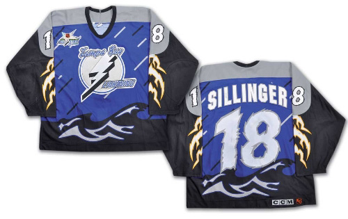
6. 1996–99 Third Jerseys  You knew this was coming right? I don’t know if you can even place these in the “so bad it’s awesome” category. It’s currently in the lead for the most bizarre, off-the-wall and randomly designed jersey to ever play an NHL game. Where do we even start?
Yes, the reference of the jersey’s concept is obvious. The team is called the Lightning, they play in Tampa, situated on a bay off the Gulf of Mexico, so having rainstorm/lightning/waves makes sense…but it’s pretty literal, right? The Bruins don’t have a forest motif full of bears jersey. The Oilers don’t have a dramatic oil rig landscape jersey. The Penguins don’t have an Antarctic-scape jersey. But, more than that, it’s the execution of the jersey that makes it feel like a joke.
First off, rectangular rain? Maybe jersey production methods back then were not what they are now, but these solid blocks of grey and black raindrops are ridiculous. Most 8-bit video games have better rain design than these jerseys. It’s ridiculously lazy designing. The other elements – lightning bolts and waves – at least have some depth to them and look like what they’re supposed to look like.
Then there’s the way the colours are completely blocked off on this jersey. Grey shoulder yokes (why?), black sleeves (why??), and the actual storm-scape takes over only the torso of the jersey. The result: a weirdly chunky and disjointed hot mess. If you’re going for a dramatic lightning storm theme, why not just cover the jersey in it and remove the blocks of color that serve no purpose other than to distract from the original concept. GAH! SO BAD!
Then there’s the numbers on the sleeves and back, which are incredibly zig-zaggy and very oddly-textured because…dramatic! It’s a storm! Get it? GET IT?!?!
Yeah buddy, we got it. We also got that you couldn’t design your way out of a wet paper bag. You’re the only one laughing about this joke Esposito.
Jersey Recommendation: #22 Ciccarelli. All this being said, I’d still love to own one of these jersey, because they’re so ridiculous. And why Ciccarelli? Why not? It’s kind of hilarious and most people forget the Hall-of-Famer even played for the Lightning. But he did, and he let himself be photographed wearing this jersey.
5. 2014–present Third Jerseys  This jersey, which I affectionately like to call Lightning’s emo jersey, is miles ahead of the previously discussed jersey, but it’s still not very good. If you want a full breakdown of this jersey, I did a full article about them when they were released. If you want the short version, stick with me here.
First issue: they’re a rip-off of the Kings‘ jerseys. Straight-up. There’s no arguing it. If you remove the Kings’ sleeve stripes, the design is almost identical. Change silver to blue in a few places and you’ve got the same jersey.
Second: for a team that ditched black from their brand in 2011, they sure jumped back into it in a big way. Regular readers know how I feel about black jerseys, which fail to capitalize on hockey’s advantage of having a blank canvas of white ice to have a visually interesting game. With these being worn, it’s black jerseys versus white jerseys on white ice. Monochromatic and boring. Think Sharks/Kings, then think 2014 Winter Classic. And didn’t black jerseys die with the ’90s/’00s?
Third: Bolts. Really? Yes, I get it, “bolts of lightning.” But that’s not your team name. Ever seen a Montreal Canadiens jersey with “Habs” written on it? A Washington Capitals jersey with “Caps”? Senators with “Sens”. Oh, wait. The point is, it’s doesn’t scream “professional hockey franchise” to slap a nickname on the front of your jersey to replace your team crest.
I like the minimalist and modern concept in the design, but everything else just kind of ruined it for me. It ends being flat, boring and oddly off-brand.
Jersey Recommendation: #30 Bishop. The Lightning have a whole bunch of young talent on the team now, but I always like giving some love to the goaltenders, and Tampa’s seemed to have found their franchise goalie. I’d also be tempted by a #77 Hedman though.
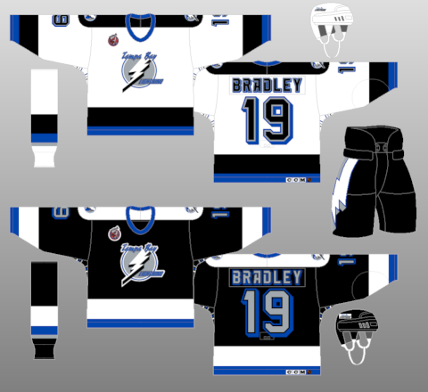
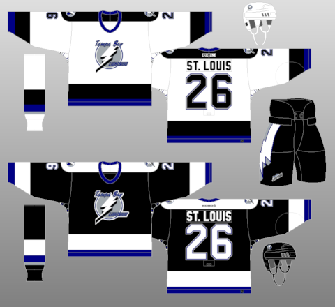
4. 2008–2014 Third Jerseys  You can start to tell I’m not big on the Bolts’ third jerseys by now. These ones are placed ahead of the current thirds because at least they’re not completely black. Royal blue is the dominant colour, with the addition of some grey in there too, making it a little more visually interesting. But that doesn’t mean they’re that good yet.
There’s still the “Bolts” across the front. And then there’s the “Tampa Bay” which covers the players’ asses on the bottom of the back of the jerseys. The reasoning for this was to be a helpful reminder for opposing teams who are back-checking Lightning players as to which city they are currently in.
“Where am I? And who does this ‘Stamkos’ guy play for? He’s pretty fast. Oh yeah, Tampa Bay! Thanks, jersey designer, for putting that on there for me!”
Seriously, that’s the only reason I can come up with. Otherwise, there’s absolutely no reason why that would be there. I’ve seen some teams play with city names on the front in the striping, but on the back? First time, I believe. If I’m wrong, feel free to correct me in the comments below.
The other negative, the pit stains. No idea why teams do this, but there’s a few who do. And I’m not crazy about the pinstripe white stripes on the front and back of the jersey. Feels totally unnecessary and just makes the jersey look more cluttered.
Otherwise, it’s a step in the right direction for this list. The striping is relatively consistent and the grey adds some diversity and contrast to the jersey. If you have to have black on a jersey, limiting it to the cuffs and stripes is a great way to include it, as the main color (blue) still is the dominant one.
Jersey Recommendation: #26 St Louis. I’m not entirely sure how the Tampa fanbase feels about St Louis these days, seeing how he deserted them last season, but he’s still one of the best players to ever put on a Lightning jersey.
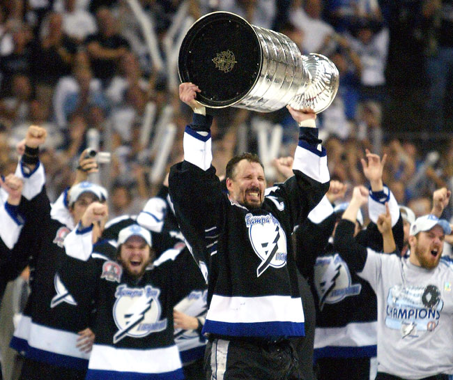
3. 1992–2007 Home & Away Jerseys  Step by step, the jerseys are improving, with these original Lightning jerseys being a perfect example of classic jersey design. They’re not overly innovative or interesting in their concept, but there’s a simple strength to them: thick lines, no frills, strong colours.
But they’re actually very innovative in their use of typography. The jerseys pictured here were worn during the 1993–94 season, and these same jersey designs actually had 4 different uses of typography: the originals from 1992–93 (with the Rangers-esque drop shadow), 1993–94 (pictured here), 1995–2001 (with the erratic script font), and 2001–07 (with the generic sports blocked-off corner font). Personally, I like the one pictured here the best.
What makes them innovative is that they were the first team since Pittsburgh in 1967–68 to use a typeface different from the generic one that every other team used (and most still use it). The 1993–94 jerseys shown above still have the blocked-off corners, but they were the first to italicize the font. And the typeface for the names were stylized as well (and they were for the inaugural 1992–93 season also). The NHL were the first to use a completely new font on jerseys for the 1992–93 All-Star Game. But, the next season (1994–95), the Lightning became the first franchise the next season to ever use a custom typeface, or something other than the generic typeface (again, other than the aforementioned Penguins), with their erratic script font. That same 1994–95 season, the Calgary Flames copied the previous season’s Tampa Bay jerseys and italicized their numbers/nameplates.
Today, 13 of the 30 NHL teams have used different typefaces for their jerseys (or third jerseys) than the generic one. Ironically, Tampa Bay isn’t one of them anymore, but they were the original trendsetters and broke a mould with these jerseys.
Other than that, again, they’re simple, strong and minimal. A classic hockey jersey and, if anything, it’s almost bordering on boring. But with the typography, there’s at least a little bit of innovation thrown in.
It still would have been a better choice to have a blue jersey instead of a black one, for reasons already stated. Just not digging the black. And the grey lettering on the black jerseys don’t have the same impact white numbers/letters would have had. But, it’s still a simple, classic jersey. Oh, and it’s raised a Cup, which always looks good.
Jersey Recommendation: #17 Fedotenko. He’s maybe not the most well-known player to wear the Lightning jersey, but he scored Tampa’s only 2 goals in Game 7 against the Flames in 2004. If you want to celebrate the Cup win with this jersey, there’s no better choice.
2. 2011–present Home & Away Jerseys  For a few blissful years, from 2011–14, Tampa Bay didn’t have a black jersey. Their third jersey was predominantly blue, and this sharp-looking home and road set was released in 2011, which they still wear today. And they’re fantastic jerseys with nothing to complain about.
Well, okay, maybe. There’s always something. It wouldn’t be in second place if there wasn’t anything.
But first, what works: there’s an incredible amount of restraint in the design of these jerseys. Extremely simple, with only one colour and only a single stripe on both the sleeves and bottoms of the jerseys. The only other teams to have shown that amount of restraint is maybe Detroit, who’ve been wearing their iconic jersey set for over 80 years now. Even Toronto, which many accused these jerseys of copying, has two stripes on their jerseys. And it’s a good reflection of the new logo featured on these jerseys: simplified, iconic, stripped down to its essentials.
The blue is great, the laces on the collars are great, the elegant simplicity of them is great.
All that being said, it’s been scaled down a little bit too much. I had the same complaint about the logo (which was ranked 22nd in the league), where it looks too generic and bland, and devoid of any risk-taking. Sure, maybe the risks they took with their jerseys didn’t always work out, but they did change the league with their use of typography originally, and something innovative here – anything at all – would have created something more interesting and maybe pushed jersey design further into the 21st century. Borrowing aesthetics legacies from the likes of the Wings and Leafs have don’t automatically give a young franchise the same historicity and credibility.
That being said, these are really beautiful jerseys and worth of being ranked this highly on the list. But they feel a little bit of a missed opportunity, which keeps them out of first place. Jersey Recommendation: #91 Stamkos. Duh.
1. 2007–11 Home & Away Jerseys  Winner, winner, chicken dinner! These jerseys, released after the full-scale re-design of the jerseys in the league with the Reebok Edge jerseys, take top spot. It’s extremely close though, because there’s issues with this one as well.
The most obvious issue: the numbers on the front. I’ve never been a big fan of these, as they don’t really serve a purpose other than to reinforce hockey’s inferiority complex in North America and mimic football, basketball (and sometimes baseball) which all have numbers on the front. Really? The big, bold placement of the team logo on the front of the jersey (which no other major sport has) is what makes hockey jerseys so great. Just leave the number off the front, they’re already on the sleeves. On the plus side, the rest of the front of the jerseys are incredibly simple, so at least the numbers aren’t making it overly busy.
Of course, the other issue, is the black jerseys. But, I don’t mind black jerseys if they have a lot of colour of them to balance it out, and there’s a good amount of blue on the sleeves here.
One of the biggest plusses about these jerseys are that they still have an elegant simplicity to them (and removing all grey from the jersey was a good idea too), but they’re not generic at all. In fact, they’re slightly innovative being one of the few teams to introduce a completely different take on the traditional hockey stripes with the new Reebok Edge jerseys. Teams like Pittsburgh and Ottawa did similar things, but took things just a step too far to look really great. Tampa, again, showed some restraint. I guess that’s what those horrible 1996–99 third jerseys can do for you: teach you restraint.
So, these take the top spot, but barely. There’s definitely an argument to be made to switch around #1 and #2, but for me, I’ll stick with this one. It didn’t win a Cup, it didn’t have an incredibly exciting new roster full of young talent, and that Barry Melrose season was rough, but these jerseys still balance that fine line between simplicity and innovation that create great hockey jerseys.
Jersey Recommendation: #4 Lecavalier. Yeah, his time with Tampa Bay didn’t end that gloriously, being bought out after the 2012–13 season, but he is still the longest serving Tampa Bay Lightning and was a major factor in their Cup win, including going toe-to-toe with Jarome Iginla. In his prime, he was a dominant player and a leader on the team.
We Need Your Help for an Lightning Poster
 What do you think is the biggest goal scored in Tampa Bay’s history? Or, what’s the most memorable play-by-play call made for a big Lightning goal? Let us know in the comments below and it could be epitomized as a poster similar to these ones, available at the Hockey By Design store.
Also, for this post, there’s a poster available at the Hockey By Design store, celebrating the history of the Lightning franchise (pictured left). You can buy this poster buy clicking here. Remember, there’s always free shipping at the HbD Store when you spend over $50!
Fan vote: The best Tampa Bay Lightning jersey system in franchise history
| 1992 – 2007 Original home and away | 59 |
| 1996 – 1999 “rain storm” third jersey | 35 |
| 2007 – 2011 home and away | 71 |
| 2008 blue “Bolts” third jersey | 21 |
| 2011 – present home and away | 162 |
| 2014 – present “Bolts” black third jersey | 46 |

.jpg)